You can make period features look sharper with a contemporary palette, but only if you start by pinpointing what’s original and worth protecting—cornices, ceiling roses, picture rails, timber panelling, sash windows. You’ll then build a restrained scheme: a modern neutral on walls, deeper tones on woodwork, and one confident accent to pull the eye. Before you open a tin, you must map where colour will frame each detail, because the next decision can either lift the room or flatten it…
Key Takeaways
- Audit each room’s original features, noting what’s intact, altered, or missing, and photograph mouldings in raking light for accurate restoration.
- Stabilise details first using sympathetic methods like careful paint stripping, timber repairs, and lime plaster patching to preserve crisp profiles.
- Build a base–mid–accent palette: neutral walls/ceilings, deeper woodwork tone, and one confident accent for focal points like chimney breasts.
- Map paint placement to suit the architectural hierarchy, keeping mouldings consistent, separating ceiling colour, and using contrast to push features forward or back.
- Test samples in natural UK light throughout the day, then choose durable modern finishes like eggshell or satin for period joinery and high-wear areas.
Identify the Period Features to Emphasise
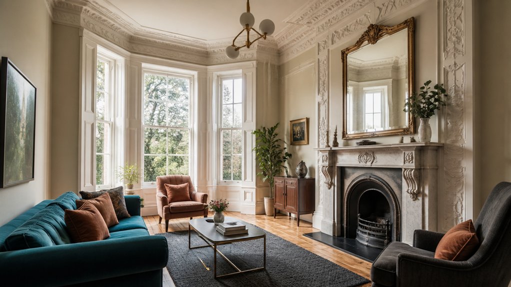
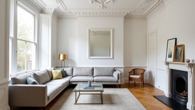
Before you pick a single contemporary colour, you’ll need to pinpoint which original period details deserve centre stage—think cornices and ceiling roses, original sash windows, fireplace surrounds, dado or picture rails, panelling, and timber floors—because these fixed architectural elements should drive your palette choices and decide where contrast will have the most impact.
Walk each room and list intact features, later alterations, and missing sections. Check proportions, joinery profiles, and paint build‑up; they’ll tell you what’s genuinely original.
Use restoration techniques such as careful stripping tests, timber repairs, and lime plaster patching to stabilise details before you highlight them.
Cross‑reference dates with local conservation guidance and pattern books to maintain historical accuracy.
Photograph mouldings in raking light and note where repairs will disappear or read as deliberate.
Build a Contemporary Colour Palette for a Period Home
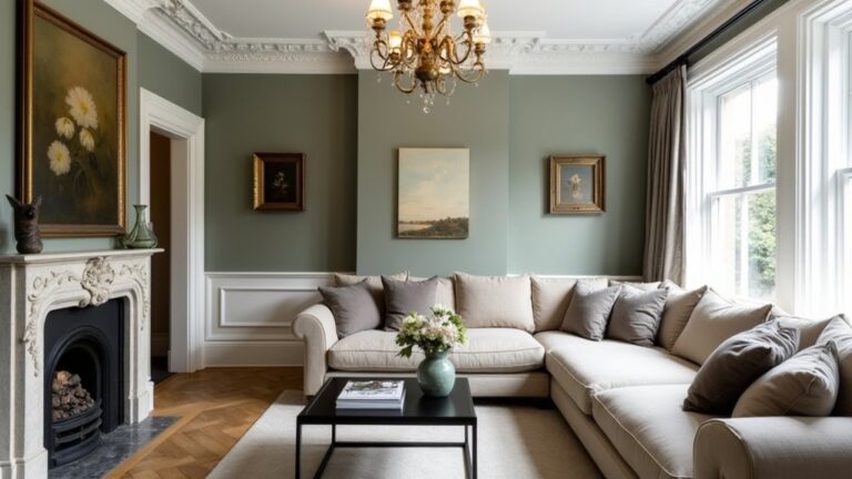
Once you’ve identified the cornices, joinery and fireplaces you want to champion, build your contemporary palette around them by setting a tight “base–mid–accent” structure: choose one calm, modern neutral for the largest planes (walls and ceilings).
A deeper mid tone should be used to shape the period woodwork (skirtings, architraves, dado rails and panelling).
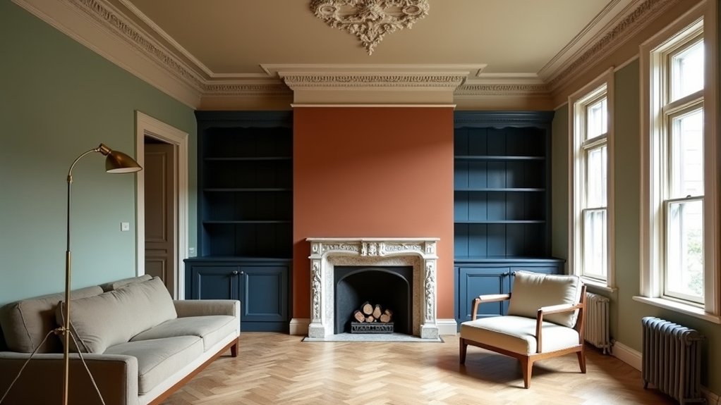
For focal points such as the chimney breast or the inside of a sash reveal, select a single confident accent.
Keep undertones aligned: pair warm stone with oxblood or umber; pair cool grey with inky blue or bottle green.
Test in UK light; north-facing rooms need warmer bases.
For authenticity, avoid Faux finishes unless you’re matching original marbling.
Use Accent walls sparingly, reserving colour for one statement note that respects plasterwork.
Ensure all paints share a similar sheen level.
Plan Paint Placement to Frame Original Details
Although your palette sets the mood, paint placement determines whether period details read as crisp architecture or visual noise. Map every feature first: cornices, picture rails, skirting, architraves, dados, ceiling roses, panelling, and fireplaces.
Keep mouldings and joinery in one consistent tone to sharpen profiles; use a deeper wall colour to push them forward, or a quieter wall colour to let carved details lead. Treat ceilings separately: in many Georgian and Victorian rooms, a slightly lighter ceiling preserves height without flattening plasterwork.
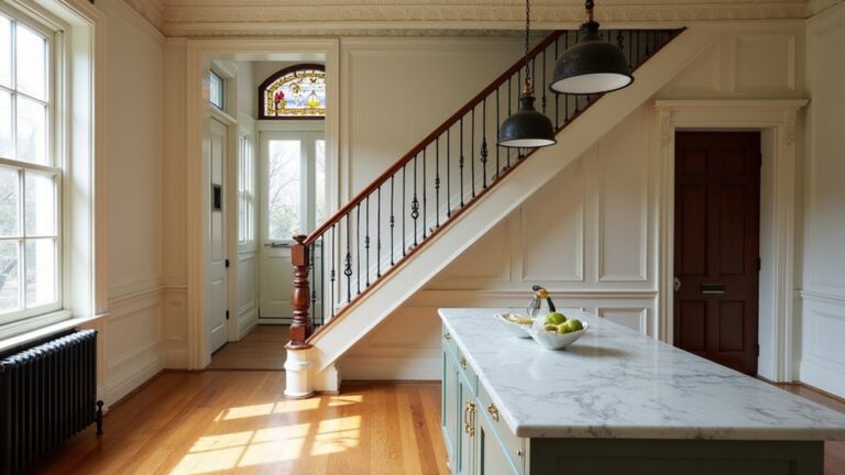
On staircases, paint spindles and strings as a single field, then pick out the handrail for legibility. For historical accuracy, follow original hierarchy: ‘background’ walls, ‘trim’ joinery, ‘feature’ focal points.
Authentic restoration means you highlight, not rewrite, the architecture.
Test Undertones and Contrast in Your Natural Light
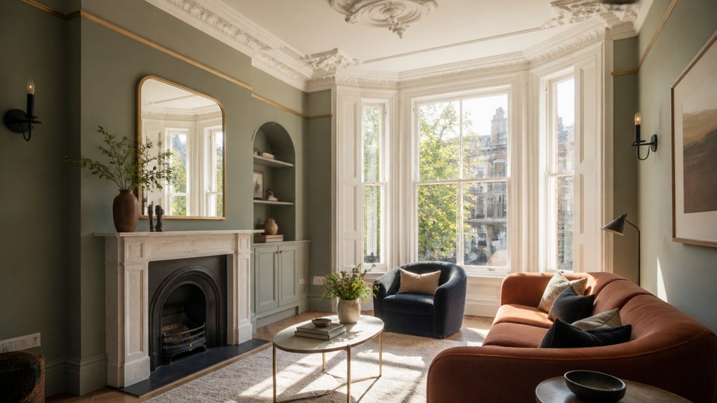
Since the same paint can read wildly differently across a day, test undertones and contrast where the room actually lives: in its natural light. Paint A4 sample cards (or sample pots) and move them around the feature you’re highlighting—cornicing, dado rails, ceiling roses—so you see edge contrast, not just a flat field.
Check morning, midday, and late afternoon, and repeat on an overcast day; UK Seasonal lighting can cool colours and exaggerate greys. Hold a true white sheet beside the sample to spot hidden green, pink, or violet undertones.
Then step back to viewing distance and judge whether the contemporary shade sharpens the original lines without looking stark. You’ll keep Historical authenticity by matching contrast to the room’s era and proportion.
Choose Modern Paint Finishes for Period Woodwork
Where do modern finishes make the biggest difference on period woodwork—skirtings, architraves, panelled doors and stair spindles? Start by matching sheen to wear and character.
For busy hallways, choose a water‑based satin or eggshell: it’s wipeable, low‑odour, and won’t yellow like old oil.
Use durable acrylic trim paint on doors and handrails; opt for a tougher polyurethane‑reinforced formula if you’ve got kids or pets.
Keep ornate mouldings crisp with an eggshell that hides minor imperfections yet still reads as a deliberate Historic accents.
Reserve high gloss for selective Vintage contrasts—newel posts, beadings, or picture rails—so light picks out profiles.
Always prime bare timber and knot‑seal resinous pine to stop bleed‑through.
Sand between coats for a sharp edge.
Conclusion
You’ve now got a clear route: pinpoint the cornices, skirtings, fireplaces, and sash frames worth keeping, then build a contemporary palette that respects them. Place neutrals on broad walls, deepen tones on woodwork, and reserve one confident accent for a focal point. Test swatches in your home’s changing daylight to catch undertones and contrast. Finish with durable modern paints. Done well, colour works like a spotlight, not a stencil.
About the Author